


Work
Resume
About Me
DESIGN SOLUTIONS
Battery Simulations - AI Assistant
Worked alongside co-designers to create AI workflows to help guide users through battery simulations.
Timeline
Sept 2025 - Dec 2025
Tools
Figma
Team
Myself, Co-UX Designers
Overview
The stakeholder was updating a tool that helped users view simulations of battery performance and cost over a given time period.
I was initially brought on to help with creating card designs for providing users with pertinent information about user defined controls, a feature that allowed users to create and program their own tools.
I later worked with a teammate to conduct a research study. My latest task involved designing a feature for comparing results.
Who Was I?
I acted as an UX Designer and worked alongside my teammates to develop various features. I spearheaded early design explorations to help provide options to build off from.
Once we had ideas in stone, I focused on bringing the homepage and history tab up to hi-fidelity, whilst supporting and receiving feedback from my coworkers and SMEs.
Projects List
01
Problem Background
02
Initial Designs
03
Adding More Functions
04
Design Solutions
Problem Background
Users sometimes had issues regarding the general process of filling out data required for the various tools and products available. Alongside this, intrepreting results
Users sometimes had issues regarding the general process of filling out data required for the various tools and products available. Alongside this, intrepreting results
Project Goals
Learn
Help the user learn more about the site’s capabilities and background
Guide
Guide the user through creating a form and simulating battery results
Summarize
Summarize the results of the simulation in an insightful way
Onboarding
Starting out, we began looking into various AI tools and research for inspiration and to see what general design trends to account for and get ideas for how to implement them for our needs.



After searching for a while, we decided on building off of the general chatbot design as it was a model that was easily recognizable and understandable by our users. For our use case, however, the chatbot would need to be more interactive and allow for back and forth unrelated to text. We made sure to keep this in mind when ideating.
From here, we laid out the ideal workflow that a user would go through when using the site.
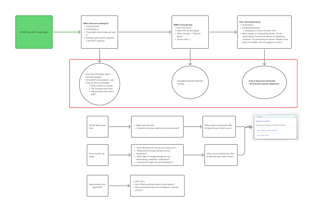
Doing this, we found that there were three sections of the site where the AI assistant’s design would differ:
Homepage
Tool Inputs
Summary Pages
This was due to the different use cases for each page, each requiring slightly different solutions.
To deal with this, we decided to create a base design for the chatbot that could work as a starting point for each page and then design more in-depth features for the pages that needed them.
Initial Designs
Tasked with creating a lo-fi design for us to build off of, I created some initial designs that encapsulated some of the requirements we had.
Lofi Designs
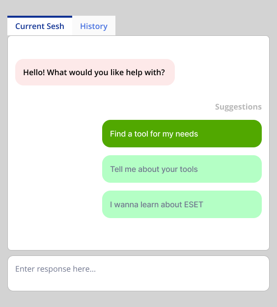
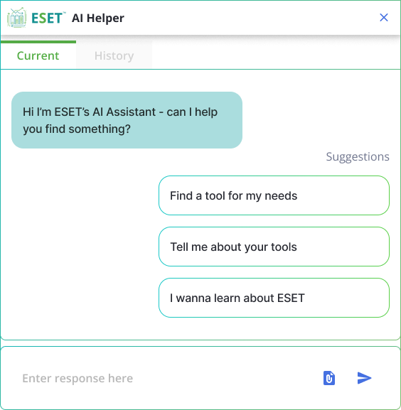
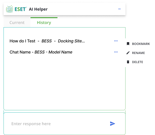
After receiving feedback from teammates and SMEs, I began to add more fidelity to the designs.
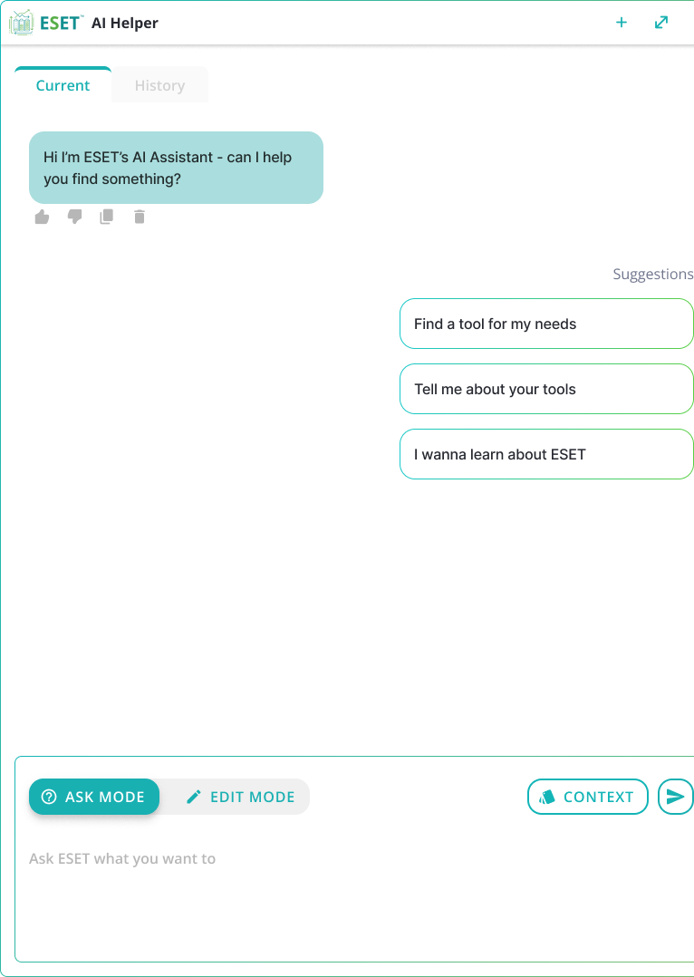
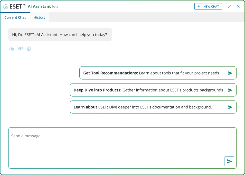
In the final round of feedback, we decided to remove the context button as it was no longer need, simplified the AI mode switch, and made it easier to identify which tool a chat was created.
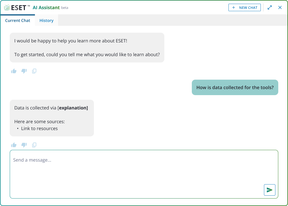
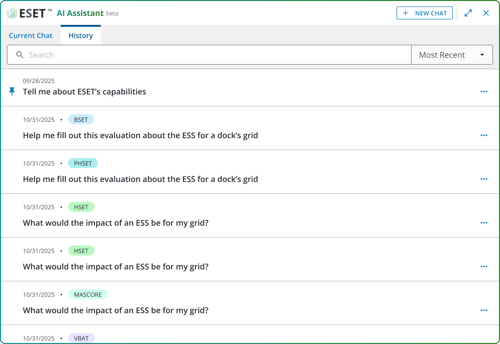
This design would work well for the homepage so we decided to work on adding additional functions for the input and output pages.
Adding More Functions - Input Pages
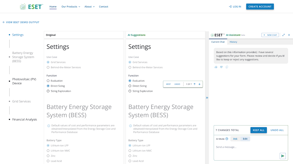
The biggest challenge for these pages would be representing changes. The AI assistant would be able to update the form for the user when in Edit mode, so we needed a way of showing that.
Some initial designs we came up with involved showing the changes within the chat box, focusing on the elements have been updated. However, one of the devs suggested having a side by side view that could sho the original page and AI edited page. This idea worked really well when testing and could be easily implemented, so we went in that direction!
We designed the side by side to make any unchanged sections lighter to bring focus to the updated/changed sections. We also added a stepper that let the user quickly move through the sections that were updated to keep or undo any AI-generated changes.
This was well received by the wider team and PM so this was implemented into the dev site for testing. A couple of weeks later, we were given some feedback:
- Form Oversight: We missed a function of the form where certain options can lead to entirely new sections being added.
- Viewing Changes: It could sometimes be difficult to tell what type of change was made - for example, if a section was added, removed, or just updated.
- Lengthy Form: Scrolling to view the changes could take a while, especially when comparing changes.
To solve these issues, we went back and added some new features. This also gave us the opportunity to improve on the general design of the application.
Design Solutions
Solution 1
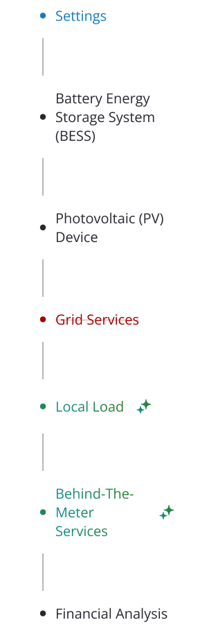
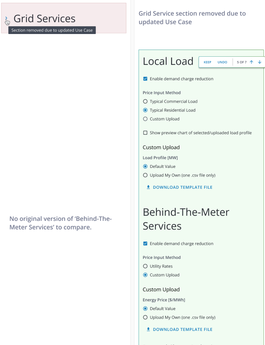
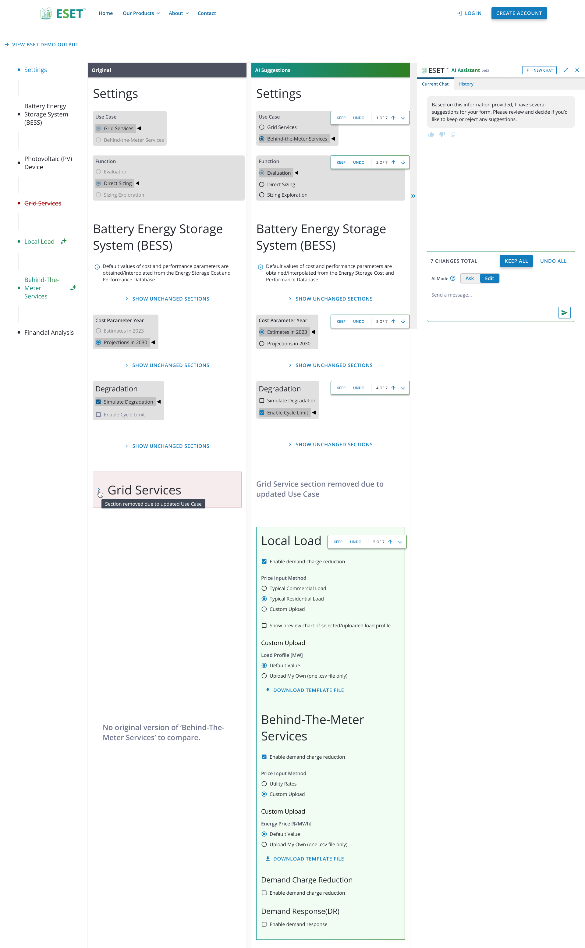
For the form oversight, I added information to the side bar to represent new sections being added and removed. Instead of just showing grayed out portions, I used green and red colors to represent added/removed sections. I also introduced the AI icon to added sections to better show that it has been edited/added by AI.
This follows into the main content via having removed sections represented by a red dropdown and added sections shown as green.
Solution 2
To further improve viewing and differentiating changes, I added grey backgrounds to areas that have been updated, with a black arrow to show the specific value.
Alongside this, we added color to the the Original and AI Suggestion headers so that people could better understand which side was the before and after.


Solution 3
For the long scroll issues, we decided to truncate sections that had not been updated at all. These would be accessible via the “Show Unchanged Sections” buttons and expand to show any areas that have not been edited.

Final Designs
Lessons Learned
Make Sure to Account for Updating Elements
Missing the sections being added/removed meant that we had to come back and add new features in. Whilst this did not take too much time to design and implement, it did lead to an increased cost that could have been mitigated earlier. Going forward, I plan on making sure that features that may not be obvious on a first look are taken into account by doing thourough walkthroughs of the site beforehand.


Work
Resume
About Me
DESIGN SOLUTIONS
Battery Simulations - AI Assistant
Worked alongside co-designers to create AI workflows to help guide users through battery simulations.
Timeline
Sept 2025 - Dec 2025
Tools
Figma
Team
Myself, Co-UX Designers
Overview
The stakeholder was updating a tool that helped users view simulations of battery performance and cost over a given time period.
I was initially brought on to help with creating card designs for providing users with pertinent information about user defined controls, a feature that allowed users to create and program their own tools.
I later worked with a teammate to conduct a research study. My latest task involved designing a feature for comparing results.
Who Was I?
I acted as an UX Designer and worked alongside my teammates to develop various features. I spearheaded early design explorations to help provide options to build off from.
Once we had ideas in stone, I focused on bringing the homepage and history tab up to hi-fidelity, whilst supporting and receiving feedback from my coworkers and SMEs.
Projects List
01
Problem Background
02
Initial Designs
03
Adding More Functions
04
Design Solutions
Problem Background
Users sometimes had issues regarding the general process of filling out data required for the various tools and products available. Alongside this, intrepreting results
Users sometimes had issues regarding the general process of filling out data required for the various tools and products available. Alongside this, intrepreting results
Project Goals
Learn
Help the user learn more about the site’s capabilities and background
Guide
Guide the user through creating a form and simulating battery results
Summarize
Summarize the results of the simulation in an insightful way
Onboarding
Starting out, we began looking into various AI tools and research for inspiration and to see what general design trends to account for and get ideas for how to implement them for our needs.
After searching for a while, we decided on building off of the general chatbot design as it was a model that was easily recognizable and understandable by our users. For our use case, however, the chatbot would need to be more interactive and allow for back and forth unrelated to text. We made sure to keep this in mind when ideating.
From here, we laid out the ideal workflow that a user would go through when using the site.
Doing this, we found that there were three sections of the site where the AI assistant’s design would differ:
Homepage
Tool Inputs
Summary Pages
This was due to the different use cases for each page, each requiring slightly different solutions.
To deal with this, we decided to create a base design for the chatbot that could work as a starting point for each page and then design more in-depth features for the pages that needed them.
Initial Designs
Tasked with creating a lo-fi design for us to build off of, I created some initial designs that encapsulated some of the requirements we had.
Lofi Designs
After receiving feedback from teammates and SMEs, I began to add more fidelity to the designs.
In the final round of feedback, we decided to remove the context button as it was no longer need, simplified the AI mode switch, and made it easier to identify which tool a chat was created.
This design would work well for the homepage so we decided to work on adding additional functions for the input and output pages.
Adding More Functions - Input Pages
The biggest challenge for these pages would be representing changes. The AI assistant would be able to update the form for the user when in Edit mode, so we needed a way of showing that.
Some initial designs we came up with involved showing the changes within the chat box, focusing on the elements have been updated. However, one of the devs suggested having a side by side view that could sho the original page and AI edited page. This idea worked really well when testing and could be easily implemented, so we went in that direction!
We designed the side by side to make any unchanged sections lighter to bring focus to the updated/changed sections. We also added a stepper that let the user quickly move through the sections that were updated to keep or undo any AI-generated changes.
This was well received by the wider team and PM so this was implemented into the dev site for testing. A couple of weeks later, we were given some feedback:
- Form Oversight: We missed a function of the form where certain options can lead to entirely new sections being added.
- Viewing Changes: It could sometimes be difficult to tell what type of change was made - for example, if a section was added, removed, or just updated.
- Lengthy Form: Scrolling to view the changes could take a while, especially when comparing changes.
To solve these issues, we went back and added some new features. This also gave us the opportunity to improve on the general design of the application.
Design Solutions
Solution 1
For the form oversight, I added information to the side bar to represent new sections being added and removed. Instead of just showing grayed out portions, I used green and red colors to represent added/removed sections. I also introduced the AI icon to added sections to better show that it has been edited/added by AI.
This follows into the main content via having removed sections represented by a red dropdown and added sections shown as green.
Solution 2
To further improve viewing and differentiating changes, I added grey backgrounds to areas that have been updated, with a black arrow to show the specific value.
Alongside this, we added color to the the Original and AI Suggestion headers so that people could better understand which side was the before and after.
Solution 3
For the long scroll issues, we decided to truncate sections that had not been updated at all. These would be accessible via the “Show Unchanged Sections” buttons and expand to show any areas that have not been edited.
Final Designs
Lessons Learned
Make Sure to Account for Updating Elements
Missing the sections being added/removed meant that we had to come back and add new features in. Whilst this did not take too much time to design and implement, it did lead to an increased cost that could have been mitigated earlier. Going forward, I plan on making sure that features that may not be obvious on a first look are taken into account by doing thourough walkthroughs of the site beforehand.
Work
Resume
About Me
DESIGN SOLUTIONS
Battery Simulations - AI Assistant
Worked alongside co-designers to create AI workflows to help guide users through battery simulations.
Timeline
Sept 2025 - Dec 2025
Tools
Figma
Team
Myself, Co-UX Designers
Overview
The stakeholder was updating a tool that helped users view simulations of battery performance and cost over a given time period.
I was initially brought on to help with creating card designs for providing users with pertinent information about user defined controls, a feature that allowed users to create and program their own tools.
I later worked with a teammate to conduct a research study. My latest task involved designing a feature for comparing results.
Who Was I?
I acted as an UX Designer and worked alongside my teammates to develop various features. I spearheaded early design explorations to help provide options to build off from.
Once we had ideas in stone, I focused on bringing the homepage and history tab up to hi-fidelity, whilst supporting and receiving feedback from my coworkers and SMEs.
Projects List
01
Problem Background
02
Initial Designs
03
Adding More Functions
04
Design Solutions
Problem Background
Users sometimes had issues regarding the general process of filling out data required for the various tools and products available. Alongside this, the process of updating simulations, uploading data and interpreting results was complex and could take a while.
As such, an AI assistant was proposed to be added that could help guide the user through the site, if needed, and help them complete the various forms and view insights about their results.
Project Goals
Learn
Help the user learn more about the site’s capabilities and background
Guide
Guide the user through creating a form and simulating battery results
Summarize
Summarize the results of the simulation in an insightful way
Onboarding
Starting out, we began looking into various AI tools and research for inspiration and to see what general design trends to account for and get ideas for how to implement them for our needs.
After searching for a while, we decided on building off of the general chatbot design as it was a model that was easily recognizable and understandable by our users. For our use case, however, the chatbot would need to be more interactive and allow for back and forth unrelated to text. We made sure to keep this in mind when ideating.
From here, we laid out the ideal workflow that a user would go through when using the site.
Doing this, we found that there were three sections of the site where the AI assistant’s design would differ:
Homepage
Tool Inputs
Summary Pages
This was due to the different use cases for each page, each requiring slightly different solutions.
To deal with this, we decided to create a base design for the chatbot that could work as a starting point for each page and then design more in-depth features for the pages that needed them.
Initial Designs
The base design had a few requirements:
- Had to take into account multiple tests from different tools
- Allowed the user to view previous results
- Let user swap modes(ask vs. edit) when entering form information
Tasked with creating a lo-fi design for us to build off of, I created some initial designs that encapsulated some of the requirements we had.
Lofi Designs
After receiving feedback from teammates and SMEs, I began to add more fidelity to the designs.
In the final round of feedback, we decided to remove the context button as it was no longer need, simplified the AI mode switch, and made it easier to identify which tool a chat was created.
This design would work well for the homepage so we decided to work on adding additional functions for the input and output pages.
Adding More Functions - Input Pages
The biggest challenge for these pages would be representing changes. The AI assistant would be able to update the form for the user when in Edit mode, so we needed a way of showing that.
Some initial designs we came up with involved showing the changes within the chat box, focusing on the elements have been updated. However, one of the devs suggested having a side by side view that could sho the original page and AI edited page. This idea worked really well when testing and could be easily implemented, so we went in that direction!
We designed the side by side to make any unchanged sections lighter to bring focus to the updated/changed sections. We also added a stepper that let the user quickly move through the sections that were updated to keep or undo any AI-generated changes.
This was well received by the wider team and PM so this was implemented into the dev site for testing. A couple of weeks later, we were given some feedback:
- Form Oversight: We missed a function of the form where certain options can lead to entirely new sections being added.
- Viewing Changes: It could sometimes be difficult to tell what type of change was made - for example, if a section was added, removed, or just updated.
- Lengthy Form: Scrolling to view the changes could take a while, especially when comparing changes.
To solve these issues, we went back and added some new features. This also gave us the opportunity to improve on the general design of the application.
Design Solutions
Solution 1
For the form oversight, I added information to the side bar to represent new sections being added and removed. Instead of just showing grayed out portions, I used green and red colors to represent added/removed sections. I also introduced the AI icon to added sections to better show that it has been edited/added by AI.
This follows into the main content via having removed sections represented by a red dropdown and added sections shown as green.
Solution 2
To further improve viewing and differentiating changes, I added grey backgrounds to areas that have been updated, with a black arrow to show the specific value.
Alongside this, we added color to the the Original and AI Suggestion headers so that people could better understand which side was the before and after.
Solution 3
For the long scroll issues, we decided to truncate sections that had not been updated at all. These would be accessible via the “Show Unchanged Sections” buttons and expand to show any areas that have not been edited.
Final Designs
Lessons Learned
Make Sure to Account for Updating Elements
Missing the sections being added/removed meant that we had to come back and add new features in. Whilst this did not take too much time to design and implement, it did lead to an increased cost that could have been mitigated earlier. Going forward, I plan on making sure that features that may not be obvious on a first look are taken into account by doing thorough walkthroughs of the site beforehand.