


Work
Resume
About Me
DESIGN SOLUTIONS - USER INTERVIEWS - DESIGN SUGGESTIONS
ES Control
Created design solutions for various features and co-led a research study into improving various aspects of the sites.
Timeline
Sept 2024 - June 2025
Tools
Figma
Team
Myself, Co-UX, Mentor
Overview
The stakeholder was updating a tool that helped users view simulations of battery performance and cost over a given time period.
I was initially brought on to help with creating card designs for providing users with pertinent information about user defined controls, a feature that allowed users to create and program their own tools.
I later worked with a teammate to conduct a research study. My latest task involved designing a feature for comparing results.
Who Was I?
Acting as a User Experience Consultant, I led stakeholder meetings involving devs, other UX personnel, and PMs to better unite understanding of the tool and next steps for the project.
As an Assistant UX Researcher, I helped organize user interviews with my coworker and led some of the interview sessions. I also supported heuristic evaluation efforts to test overall site usability.
Finally, as a UX Designer, I designed and improved various features: User Defined Controls results and preview cards and comparison feature.
Projects List
01
Comparison Tool Design
02
User Defined Controls
Comparison Tool
Users often used the results of the simulated batteries to make decisions about their next moves and having to switch back and forth between various windows could be bothersome. It also made it more difficult to directly compare results due to having to remember the myriad of various parameters.
Due to this, I was asked to design a tool for users to compare various results to each other.
Starting Off
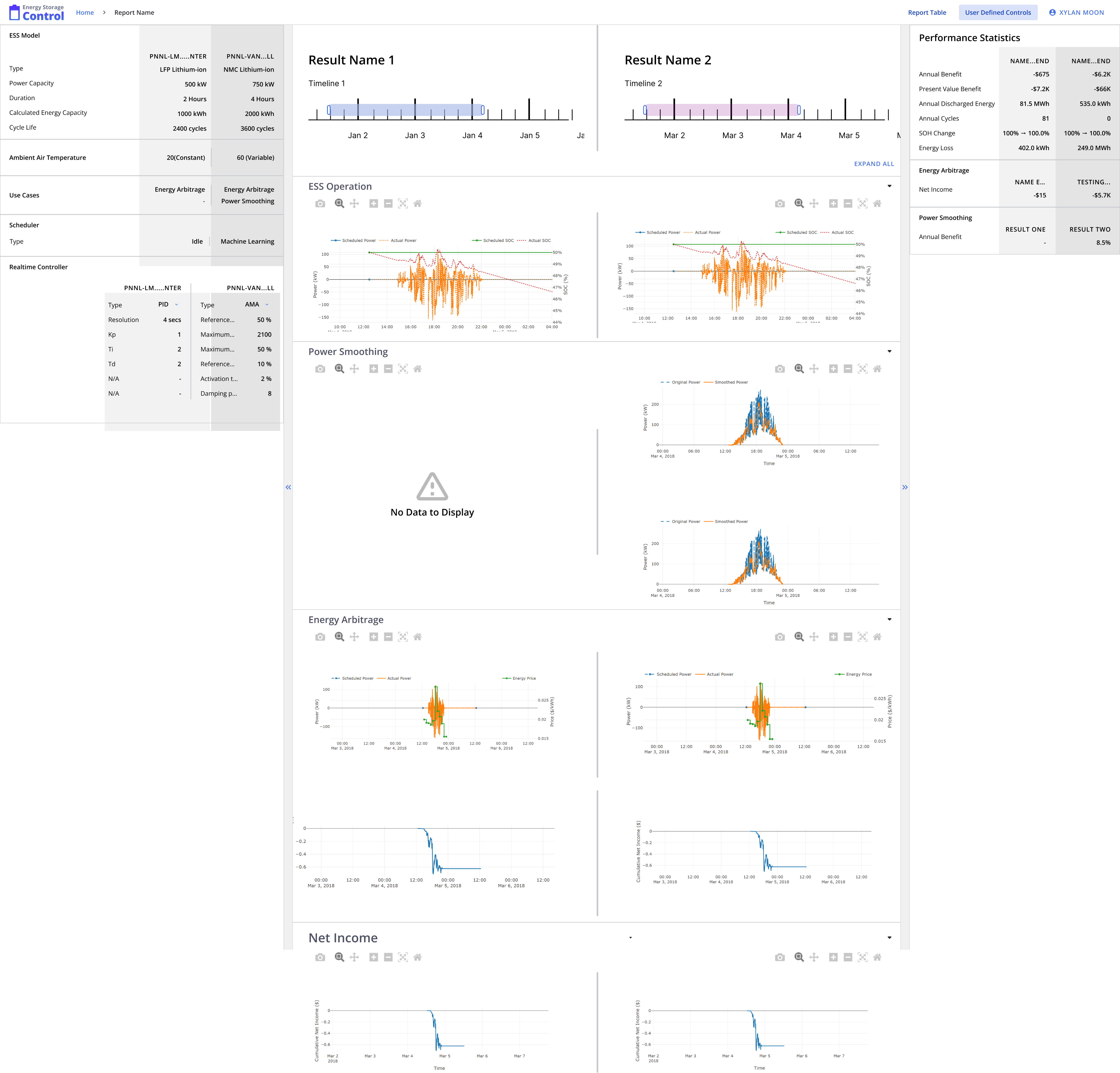
For the beginning of this design, I took inspiration from different sites’ various layouts for comparing items. I focused on sites where comparisons between item contained tons of information, leading me to shopping sites such as Apple and BestBuy.
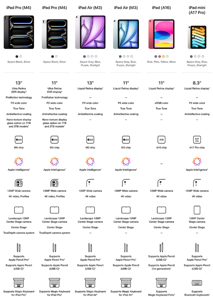
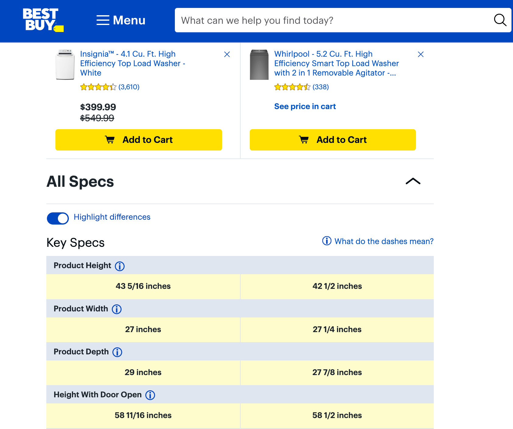
What these sites did well at was displaying
These allowed me to get a good starting point and I began ideating some options for the developers to choose from.
Building It Up
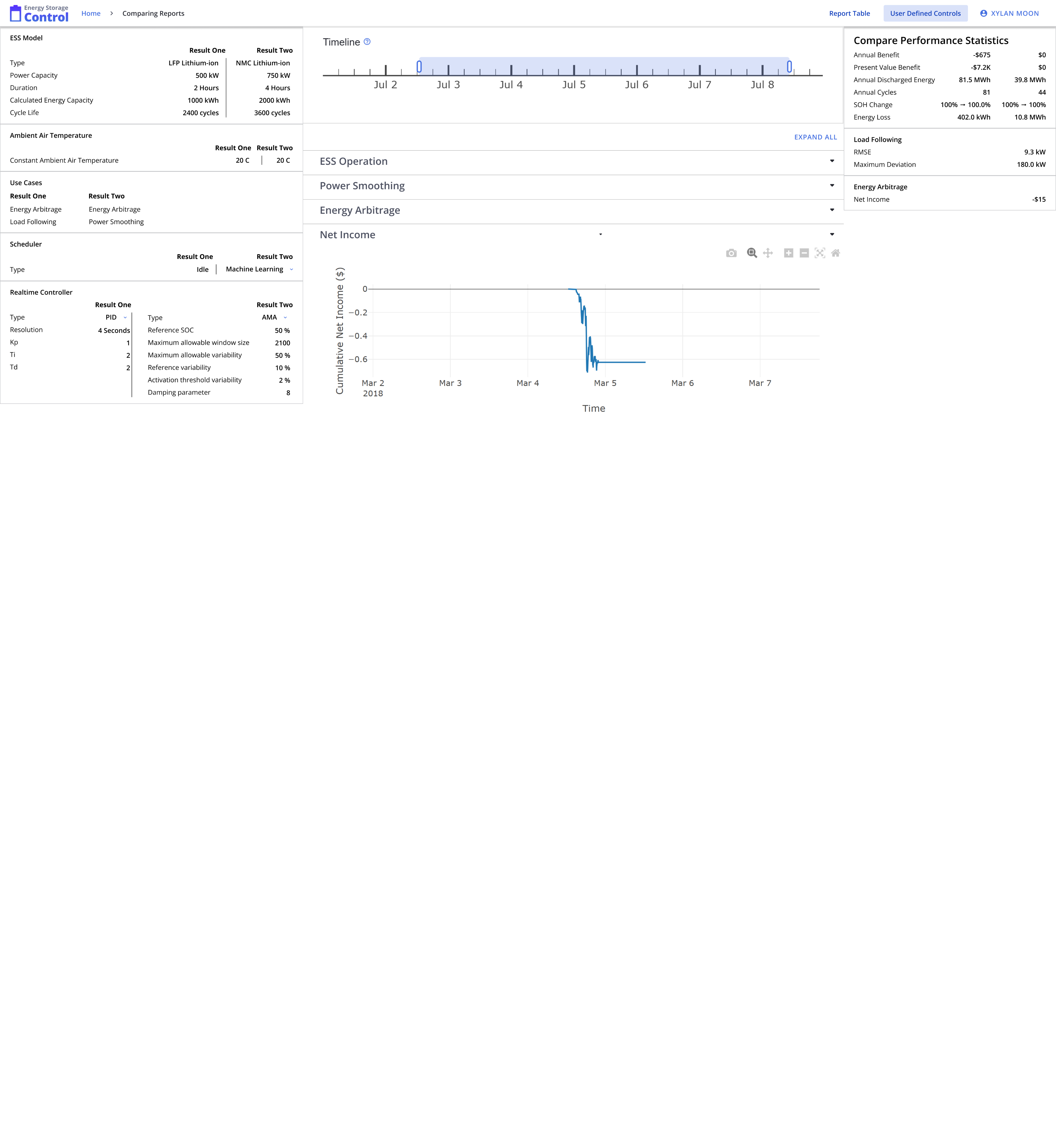
After meeting with the developers and stakeholders, I learned that they preferred the color coordinated option, so I built off of that one to bring back to them.
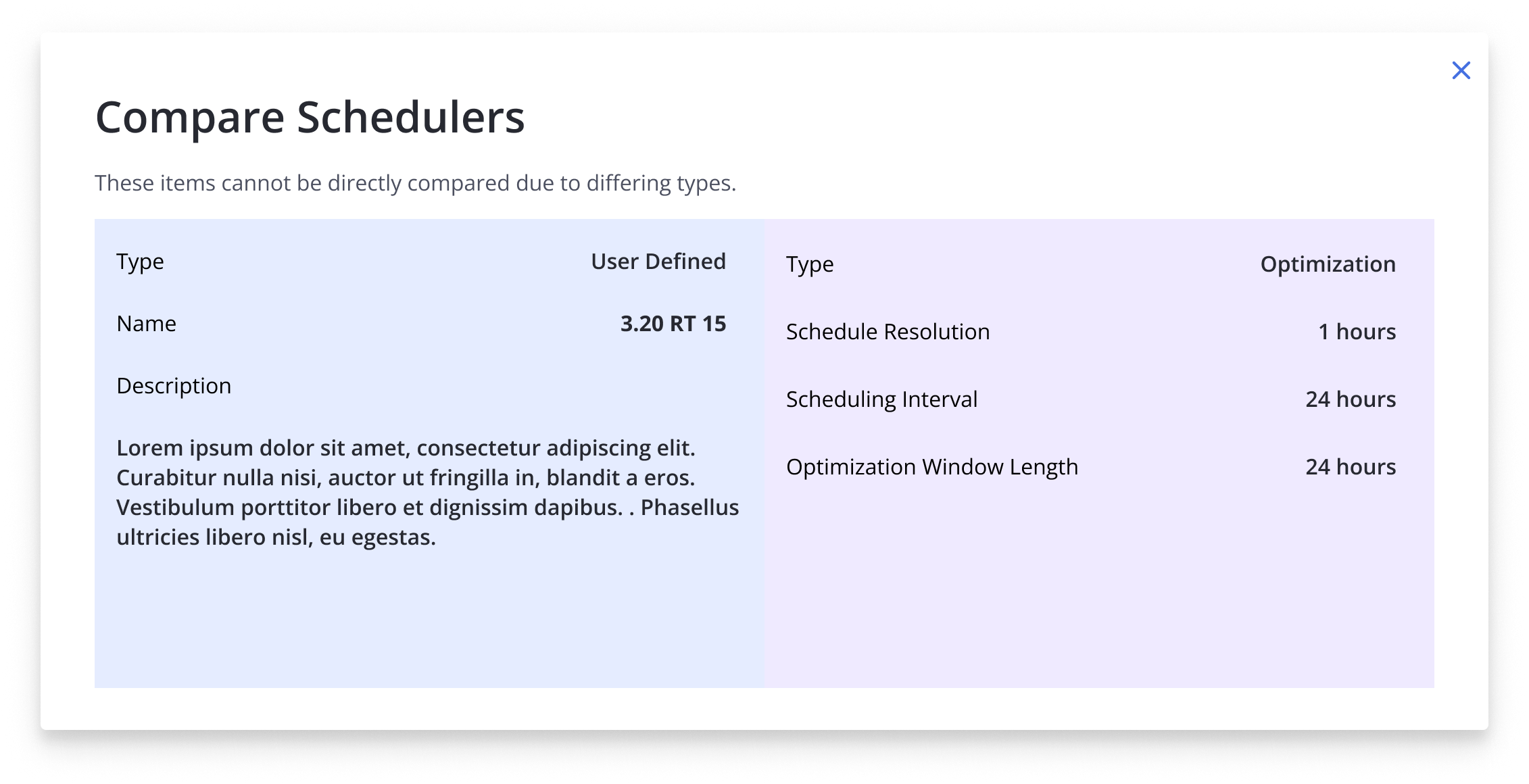
When working on the design, one of the challenges was accounting for differing inputs. For the Scheduler and Realtime Controller(RTC) inputs, the only parameter they always shared was the typing. However, if the typing didn’t match up, then the other parameters could be vastly different, making a direct comparison impossible.
One proposed solution was to make these sections act as dropdowns, with typing being the only visible parameter on load. This would allow the user to see if they differed and then if they needed to see more information, use the dropdown. This would save some space and cognitive load but didn’t quite solve the issue.
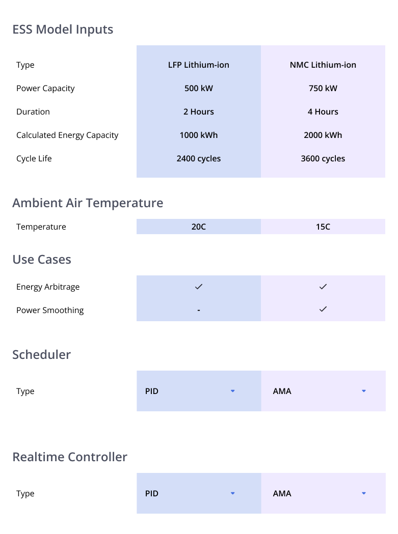
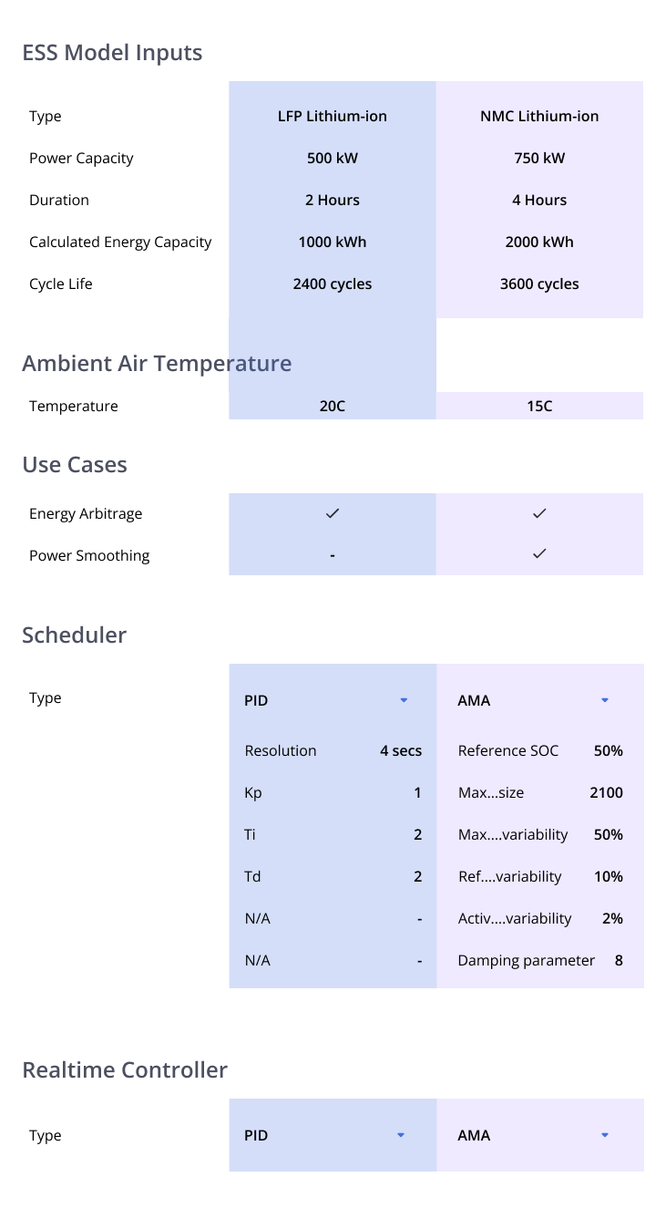
What we found worked best for the timing of the project was to add a disclaimer to these sections, stating that direct comparisons may not be possible in cases where the typing didn’t match up. This helped clear up confusion but still allowed for users to see how the parameters might change from simulation to simulation.
When speaking with shareholders further, we learned a couple of things:
- Users may not need to see the in-depth parameters for the Scheduler and RTC controls at all times
- User Defined Controls(UDCs) would need to be taken into account and parsed out here.
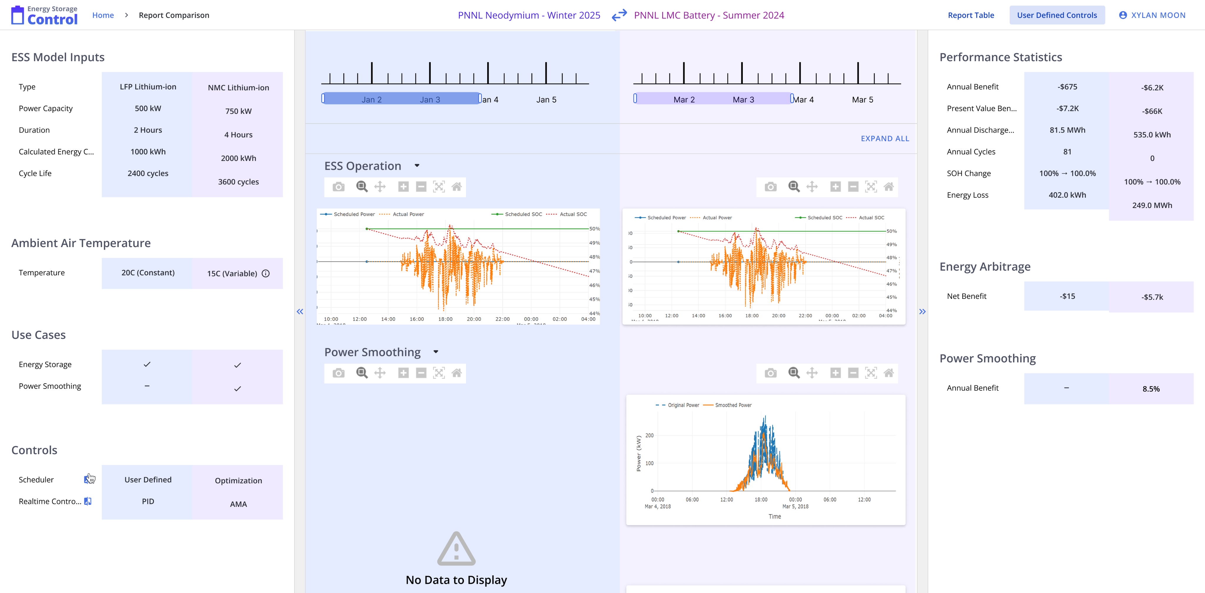
With these learnings, I went back to the design phase and built off of the dropdown idea. This solved the first issue of hiding some of the information until needed. However, space quickly became an issue.
UDCs could vary a lot depending on the settings the user chooses and creates. It could have a long description, lots of tags, and a lot of other information that would overwhelm the user and take up the narrow space that we had. This problem grew bigger if there was more than one. The solution we found to work was to bring the Scheduler and RTC controls out of that section and into a modal. This solved both issues by hiding information until needed alongside giving a lot more space for UDCs and information.
Finishing Up
The last steps were bringing the designs to Hi-Fi. I came up with some color choices that could work and meet accessibility needs. I also changed some of the formatting to fit the new ideas.
The designs were received very well by users and are scheduled to release publicly next year!
User Defined Controls

Parsing important information and controls was difficult to do
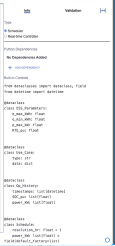
One of the main issues I found with the current UDC layout was that the panel that users used most was difficult to read and parse information.
When going to create UDCs, the users needed to be use this panel to update and see information regarding the UDCs, making it very important. It created issues as users were not easily able to differentiate the various sections from each other. This was especially true for the “Python Dependencies” and the “Built-in Controls”, which blended together.
Another minor issue with the way the tabs were laid out, causing the user to have to move further away in order to change the information they were viewing.
How did I fix this?
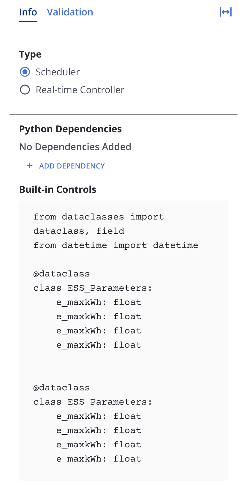
In order to fix these issues, I made a few changes:
- Increased the section title weight
- Increased the spacing between sections
- Added slight coloring to the Built-In Controls section to make it clear that it can be edited
- Grouped the tabs together
Impacts
The improvements allowed users to better parse the various sections and understand the information ahead of them. The biggest impact was that it prompted users to interact more with the Python Dependencies and Built-In Controls sections, which were important parts of editing the UDCs.
Future Improvements
As the project is ongoing, some of the ideas I have might be implemented. However, one change I would want to work on is linking this section to other parts of the site.
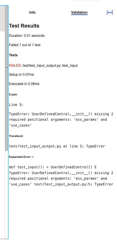
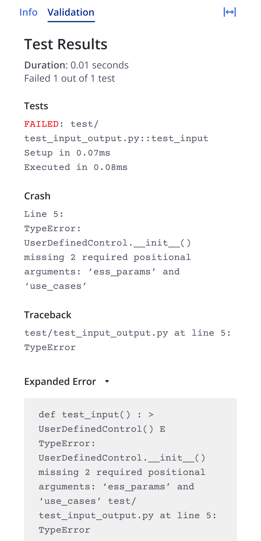
Currently, the test results show a UDC as validated or unvalidated and it would be interesting to see other information about custom UDCs that we could potentially pull from here.
Lessons Learned
Gathering Feedback Where Possible
One of the major challenges faced was gathering feedback from direct users. Due to the nature of the company, it can be hard to gather users for testing due to security and/or logistical reasons. Despite these limitations, I tried gathering feedback from other UX Designers who had access to the project, the smaller group of users who we were able to access, as well as stakeholders and devs on the team. This allowed me to gather a ton of varied feedback about issues I could not find on my own and helped improve the site a lot.
Don’t Be Afraid to Push Back
One of the main things I learned was to not be afraid to push back on certain ideas. During collaborative sessions, I could tend to be more lenient and afraid of pushing back on decisions that I felt would disrupt the user experience. This was due to this being one of the first projects that I worked on where I was acting as the UX representative.
Overtime, I learned to be more confident in stating how I felt and providing an alternative solution or a way to tweak the method to work. This led to better working sessions and


Work
Resume
About Me
DESIGN SOLUTIONS - USER INTERVIEWS - DESIGN SUGGESTIONS
ES Control
Created design solutions for various features and co-led a research study into improving various aspects of the sites.
Timeline
Sept 2024 - June 2025
Tools
Figma
Team
Myself, Co-UX, Mentor
Overview
The stakeholder was updating a tool that helped users view simulations of battery performance and cost over a given time period.
I was initially brought on to help with creating card designs for providing users with pertinent information about user defined controls, a feature that allowed users to create and program their own tools.
I later worked with a teammate to conduct a research study. My latest task involved designing a feature for comparing results.
Who Was I?
Acting as a User Experience Consultant, I led stakeholder meetings involving devs, other UX personnel, and PMs to better unite understanding of the tool and next steps for the project.
As an Assistant UX Researcher, I helped organize user interviews with my coworker and led some of the interview sessions. I also supported heuristic evaluation efforts to test overall site usability.
Finally, as a UX Designer, I designed and improved various features: User Defined Controls results and preview cards and comparison feature.
Projects List
01
Comparison Tool Design
02
User Defined Controls
Comparison Tool
Users often used the results of the simulated batteries to make decisions about their next moves and having to switch back and forth between various windows could be bothersome. It also made it more difficult to directly compare results due to having to remember the myriad of various parameters.
Due to this, I was asked to design a tool for users to compare various results to each other.
Starting Off
For the beginning of this design, I took inspiration from different sites’ various layouts for comparing items. I focused on sites where comparisons between item contained tons of information, leading me to shopping sites such as Apple and BestBuy.
What these sites did well at was displaying
These allowed me to get a good starting point and I began ideating some options for the developers to choose from.
Building It Up
After meeting with the developers and stakeholders, I learned that they preferred the color coordinated option, so I built off of that one to bring back to them.
When working on the design, one of the challenges was accounting for differing inputs. For the Scheduler and Realtime Controller(RTC) inputs, the only parameter they always shared was the typing. However, if the typing didn’t match up, then the other parameters could be vastly different, making a direct comparison impossible.
One proposed solution was to make these sections act as dropdowns, with typing being the only visible parameter on load. This would allow the user to see if they differed and then if they needed to see more information, use the dropdown. This would save some space and cognitive load but didn’t quite solve the issue.
What we found worked best for the timing of the project was to add a disclaimer to these sections, stating that direct comparisons may not be possible in cases where the typing didn’t match up. This helped clear up confusion but still allowed for users to see how the parameters might change from simulation to simulation.
When speaking with shareholders further, we learned a couple of things:
- Users may not need to see the in-depth parameters for the Scheduler and RTC controls at all times
- User Defined Controls(UDCs) would need to be taken into account and parsed out here.
With these learnings, I went back to the design phase and built off of the dropdown idea. This solved the first issue of hiding some of the information until needed. However, space quickly became an issue.
UDCs could vary a lot depending on the settings the user chooses and creates. It could have a long description, lots of tags, and a lot of other information that would overwhelm the user and take up the narrow space that we had. This problem grew bigger if there was more than one. The solution we found to work was to bring the Scheduler and RTC controls out of that section and into a modal. This solved both issues by hiding information until needed alongside giving a lot more space for UDCs and information.
Finishing Up
The last steps were bringing the designs to Hi-Fi. I came up with some color choices that could work and meet accessibility needs. I also changed some of the formatting to fit the new ideas.
The designs were received very well by users and are scheduled to release publicly next year!
User Defined Controls
Parsing important information and controls was difficult to do
One of the main issues I found with the current UDC layout was that the panel that users used most was difficult to read and parse information.
When going to create UDCs, the users needed to be use this panel to update and see information regarding the UDCs, making it very important. It created issues as users were not easily able to differentiate the various sections from each other. This was especially true for the “Python Dependencies” and the “Built-in Controls”, which blended together.
There were also another minor issue with the way the tabs were laid out, causing the user to have to move further away in order to change the information they were viewing.
How did I fix this?
In order to fix these issues, I made a few changes:
- Increased the section title weight
- Increased the spacing between sections
- Added slight coloring to the Built-In Controls section to make it clear that it can be edited
- Grouped the tabs together
Impacts
The improvements allowed users to better parse the various sections and understand the information ahead of them. The biggest impact was that it prompted users to interact more with the Python Dependencies and Built-In Controls sections, which were important parts of editing the UDCs.
Future Improvements
As the project is ongoing, some of the ideas I have might be implemented. However, one change I would want to work on is linking this section to other parts of the site.
Currently, the test results show a UDC as validated or unvalidated and it would be interesting to see other information about custom UDCs that we could potentially pull from here.
Lessons Learned
Gathering Feedback Where Possible
One of the major challenges faced was gathering feedback from direct users. Due to the nature of the company, it can be hard to gather users for testing due to security and/or logistical reasons. Despite these limitations, I tried gathering feedback from other UX Designers who had access to the project, the smaller group of users who we were able to access, as well as stakeholders and devs on the team. This allowed me to gather a ton of varied feedback about issues I could not find on my own and helped improve the site a lot.
Don’t Be Afraid to Push Back
One of the main things I learned was to not be afraid to push back on certain ideas. During collaborative sessions, I could tend to be more lenient and afraid of pushing back on decisions that I felt would disrupt the user experience. This was due to this being one of the first projects that I worked on where I was acting as the UX representative.
Overtime, I learned to be more confident in stating how I felt and providing an alternative solution or a way to tweak the method to work. This led to better working sessions and
Work
Resume
About Me
DESIGN SOLUTIONS - USER INTERVIEWS - DESIGN SUGGESTIONS
ES Control
Created design solutions for various features and co-led a research study into improving various aspects of the sites.
Timeline
Sept 2024 - June 2025
Tools
Figma
Team
Myself, Co-UX, Mentor
Overview
The stakeholder was updating a tool that helped users view simulations of battery performance and cost over a given time period.
I was initially brought on to help with creating card designs for providing users with pertinent information about user defined controls, a feature that allowed users to create and program their own tools.
I later worked with a teammate to conduct a research study. My latest task involved designing a feature for comparing results.
Who Was I?
Acting as a User Experience Consultant, I led stakeholder meetings involving devs, other UX personnel, and PMs to better unite understanding of the tool and next steps for the project.
As an Assistant UX Researcher, I helped organize user interviews with my coworker and led some of the interview sessions. I also supported heuristic evaluation efforts to test overall site usability.
Finally, as a UX Designer, I designed and improved various features: User Defined Controls results and preview cards and comparison feature.
Projects List
01
Comparison Tool Design
02
User Defined Controls
Comparison Tool
Users often used the results of the simulated batteries to make decisions about their next moves and having to switch back and forth between various windows could be bothersome. It also made it more difficult to directly compare results due to having to remember the myriad of various parameters.
Due to this, I was asked to design a tool for users to compare various results to each other.
Starting Off
For the beginning of this design, I took inspiration from different sites’ various layouts for comparing items. I focused on sites where comparisons between item contained tons of information, leading me to shopping sites such as Apple and BestBuy.
What these sites did well at was displaying
These allowed me to get a good starting point and I began ideating some options for the developers to choose from.
Building It Up
After meeting with the developers and stakeholders, I learned that they preferred the color coordinated option, so I built off of that one to bring back to them.
When working on the design, one of the challenges was accounting for differing inputs. For the Scheduler and Realtime Controller(RTC) inputs, the only parameter they always shared was the typing. However, if the typing didn’t match up, then the other parameters could be vastly different, making a direct comparison impossible.
One proposed solution was to make these sections act as dropdowns, with typing being the only visible parameter on load. This would allow the user to see if they differed and then if they needed to see more information, use the dropdown. This would save some space and cognitive load but didn’t quite solve the issue.
What we found worked best for the timing of the project was to add a disclaimer to these sections, stating that direct comparisons may not be possible in cases where the typing didn’t match up. This helped clear up confusion but still allowed for users to see how the parameters might change from simulation to simulation.
When speaking with shareholders further, we learned a couple of things:
- Users may not need to see the in-depth parameters for the Scheduler and RTC controls at all times
- User Defined Controls(UDCs) would need to be taken into account and parsed out here.
With these learnings, I went back to the design phase and built off of the dropdown idea. This solved the first issue of hiding some of the information until needed. However, space quickly became an issue.
UDCs could vary a lot depending on the settings the user chooses and creates. It could have a long description, lots of tags, and a lot of other information that would overwhelm the user and take up the narrow space that we had. This problem grew bigger if there was more than one. The solution we found to work was to bring the Scheduler and RTC controls out of that section and into a modal. This solved both issues by hiding information until needed alongside giving a lot more space for UDCs and information.
Finishing Up
The last steps were bringing the designs to Hi-Fi. I came up with some color choices that could work and meet accessibility needs. I also changed some of the formatting to fit the new ideas.
The designs were received very well by users and are scheduled to release publicly next year!
User Defined Controls
Parsing important information and controls was difficult to do
One of the main issues I found with the current UDC layout was that the panel that users used most was difficult to read and parse information.
When going to create UDCs, the users needed to be use this panel to update and see information regarding the UDCs, making it very important. It created issues as users were not easily able to differentiate the various sections from each other. This was especially true for the “Python Dependencies” and the “Built-in Controls”, which blended together.
Another minor issue with the way the tabs were laid out, causing the user to have to move further away in order to change the information they were viewing.
How did I fix this?
In order to fix these issues, I made a few changes:
- Increased the section title weight
- Increased the spacing between sections
- Added slight coloring to the Built-In Controls section to make it clear that it can be edited
- Grouped the tabs together
Impacts
The improvements allowed users to better parse the various sections and understand the information ahead of them. The biggest impact was that it prompted users to interact more with the Python Dependencies and Built-In Controls sections, which were important parts of editing the UDCs.
Future Improvements
As the project is ongoing, some of the ideas I have might be implemented. However, one change I would want to work on is linking this section to other parts of the site.
Currently, the test results show a UDC as validated or unvalidated and it would be interesting to see other information about custom UDCs that we could potentially pull from here.
Lessons Learned
Gathering Feedback Where Possible
One of the major challenges faced was gathering feedback from direct users. Due to the nature of the company, it can be hard to gather users for testing due to security and/or logistical reasons. Despite these limitations, I tried gathering feedback from other UX Designers who had access to the project, the smaller group of users who we were able to access, as well as stakeholders and devs on the team. This allowed me to gather a ton of varied feedback about issues I could not find on my own and helped improve the site a lot.
Don’t Be Afraid to Push Back
One of the main things I learned was to not be afraid to push back on certain ideas. During collaborative sessions, I could tend to be more lenient and afraid of pushing back on decisions that I felt would disrupt the user experience. This was due to this being one of the first projects that I worked on where I was acting as the UX representative.
Overtime, I learned to be more confident in stating how I felt and providing an alternative solution or a way to tweak the method to work. This led to better working sessions and